One of the hardest parts of getting your marketing message across to consumers is determining what medium to do it on. In order to run a successful campaign, you need to take into account that the amount of variables paired with the consequenses of a bad decision make the placement of a message just as important as the message itself. To get the most out of your campaign without breaking the bank, you need to understand who you are trying to reach and what you want to say to them, have the ability to utilize existing channels or offerings to communicate that message, and lastly do so in a creative way that will help it stand out and grab attention of those who see it. The appropriate combination of the three will result in a strong, precise message that is both efficient and cost effective. In this month’s spotlight, we talk about working with a local casino to not only develop a creative way to promote a new restaurant they were opening, but at the same time enhance the aesthetic of their building.
The Client
Opened in 1986, San Manuel Indian Bingo & Casino is celebrating it’s 30th anniversary of offering top of the line entertainment to the greater Los Angeles area. From tabletop gaming to fine dining to live entertainment, San Manuel prides itself as being a one stop shop for adults who are looking for a place to relax and have fun. To celebrate their anniversary and continue to expand their offering to clients, they recently opened a new restaurant and live music venue called Rock & Brews, which now represents the 17th location in a international chain that is owned and operated by Paul Stanley and Gene Simmons of the band KISS. This new undertaking has allowed them to appeal to a wider audience than ever before by offering a wide assortment of rock memorabilia, themed food and drinks, and nightly live music that will not only bring in new people but also give existing patrons something to do if they want to take a break from gambling.
The Need
Since the restaurant opened last month, San Manuel has needed a way to drive awareness to the thousands of patrons that visit every day. They came to us searching for a creative, cost effective way to not only let people know that it was indeed open, but to inform them of its location on the casino grounds and encourage them to visit. After speaking with them at length about creating a billboard-style advertisement to be placed inside of the casino and the amount of real estate available / needed to do so, we learned that they were in the process of renovating an old gift shop in a high traffic area. We quickly realized that this would be the perect place to create a wall graphic that would both cover up the ongoing construction and make the inside as a whole look nicer, as well as provide a big enough space to create a intriguing display designed to catch the attention of individuals in a non-envasive way.
The Finished Product
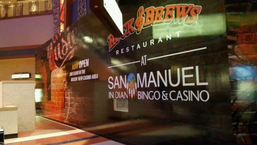
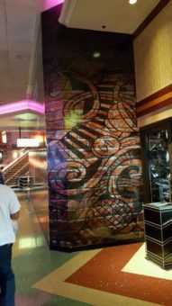
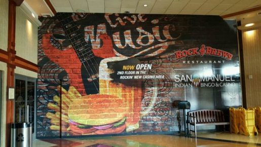
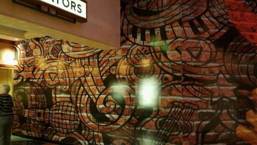
We were very pleased with the result of this collaboration, which as you can see is a printed wall graphic that stretches from floor to ceiling completely covering up the construction area while informing and encouraging patrons to check it out. We used a brick wall pattern to cover up the white wall that was there already, giving it a rustic look and improving the aesthetic as a whole of the area it was in. Here are some images of the finished product:

Wall graphics are one of the best ways to utilize available space to deliver a professional marketing message. We take pride in working with our clients to tailor to their needs, no matter what scale. Contact us today for more information on how we can work with you. jameslitho.com
